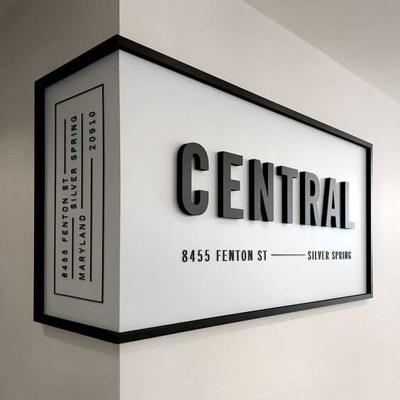
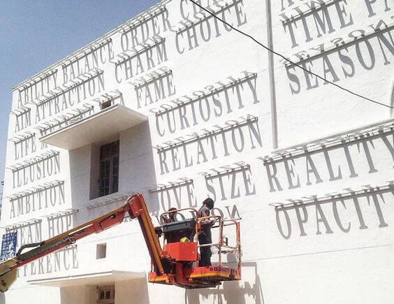
Signages have been around for ages. Its origins can actually be traced back to the Greeks and Romans when they used symbols and visual imagery to indicate businesses. This intent is still the agenda of most signages you see in both urban and rural settings. But today more than ever before, the signage is a wonderful medium to create brand identity and an aesthetic among other things. Design and art intertwine in a medium like the signage – where typography, colour theory and visual drama take the front seat in procuring a good signage.
The vintage aesthetic derived from an actual time where the form was a popular medium to grab attention to a business, is full of inspiration. Today, it’s even an edgy way to keep things interesting. The best signages communicate most in the most minimal form.

For modern businesses, signages are about far more than indicating directions. It coincides with logo making and branding, resulting in a design sensibility wrapped around brand identity.

Signage done by Decotarium for Cleartrip.
With the advent of recognising how design can be a game changer for businesses to create an identity, the signages have evolved to become aesthetic, relevant and stylised.

Signages are inherently meant to indicate direction to a destination. Signs that have the sole purpose of being directional is becoming increasingly creative and many times humorous.
The purpose of signage has also become variant and engaging, and has transformed beyond being an indicator. It has become a medium to communicate relevant and/or necessary content.

And today, with increasing demand for creative content and design, a signage can not be ruled into just one physical form. It takes on many shapes and sizes and leaves a lot of space for creative execution.

We, at Decotarium, love indulging in signage making. To know more about our work, click here.